On 23 July 2026 the European Central Bank published its shortlist of ten design series for the future euro banknotes and opened a survey where any European can weigh in until 21 September. It is the first time in almost twenty-five years that the look of the euro has genuinely been up for discussion: the notes in your wallet come from the contest won by Austrian designer Robert Kalina in 1996, and the Europa series rolled out between 2013 and 2019 hardened the security features and tweaked the colours, but never touched the windows, gateways and bridges concept.
Coverage this week has focused, predictably enough, on whether we prefer Beethoven or a kingfisher. We are interested in something else. Alongside the proposals, the jury published the report setting out the thirteen weighted criteria it used to score them, and that document is the genuinely useful part of the whole exercise: a visual identity evaluation brief, with numerical weights, applied to the brand shared by twenty countries. If you have ever had to choose between three logo proposals armed with nothing better than "I like this one more", this is for you.
What the ECB has decided, and what is still open
It is worth starting with what has not happened, because a fair few headlines this week take it as settled: there is no winning design. There is not even a winning theme. What exists is ten live proposals and an open consultation.
Here is the timeline the ECB has communicated:
| Phase | When | What happens |
|---|---|---|
| Theme selection | 2021 – 2023 | An advisory group proposes themes and 365,000 citizens weigh in through a Europe-wide survey |
| Motif selection | Jan 2024 – Jan 2025 | A second committee settles which figure, which bird and which institution goes on each denomination |
| Call for applications | 15 Jul – 18 Aug 2025 | 1,241 applications from designers across every EU country |
| Proposal development | 7 Nov 2025 – 24 Apr 2026 | 25 selected designers deliver 39 complete proposals |
| Jury assessment | 11 – 29 May 2026 | 21 experts score first alone, then together |
| Shortlist and survey | 23 Jul – 21 Sep 2026 | The 10 finalists are published and public opinion is collected |
| Governing Council decision | End of 2026 | Theme and design are chosen |
| Development and production | No date given | The chosen design is developed, tested and adapted for industrial printing |
| Circulation | "In subsequent years" | The ECB has set neither a year nor a method for the changeover |
Those last two rows need a caveat, because they are being reported this week as though they were fixed. The ECB has published no year at all for production or circulation: its press release says only that banknotes from the new series "are expected to enter circulation in subsequent years", and its FAQ adds that no decision has yet been made on "when and how" they will be put into circulation. The 2027 and 2028 dates in many headlines are reasonable journalistic extrapolation, not an official calendar.
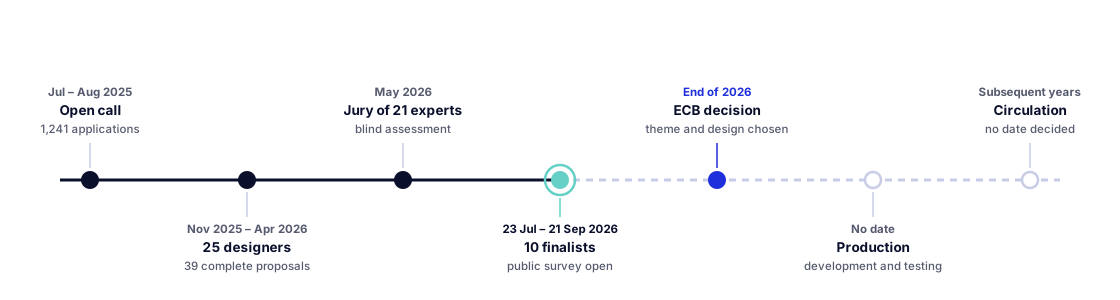
From 1,241 applications the field narrowed to 25 designers invited to produce real proposals, drawn from eleven EU countries and with around 40 % women as lead designers. Those 25 delivered 39 complete series: 23 for Rivers and birds and 16 for European culture. The jury — 21 experts, one nominated by each euro area central bank, with backgrounds in graphic design, communication, history and also neuroscience — kept ten.
One procedural detail deserves attention: the assessment was deliberately split into two steps. From 11 to 22 May each jury member scored alone and on pseudonymised proposals, without knowing who had signed each series. Only afterwards, on 28 and 29 May, did they sit down to discuss as a group. That sequence heads off two textbook biases: the prestige of the studio, and the pull of whoever speaks first in the room.
The public survey is not a referendum either. The ECB is collecting opinions online and, at the same time, has commissioned an independent company to survey a representative sample of the euro area — precisely so the outcome is not decided by whoever can mobilise the most votes. The final call belongs to the Governing Council.
The two themes: European culture and Rivers and birds
The two themes did not come out of a committee meeting, or not only: in 2023 the ECB asked the public and 365,000 people answered. Three favourites emerged — European culture, rivers and birds — and the last two were merged into one to leave two finalists. Read as brand territories, they pose very different problems.
European culture bets on people: shared cultural figures and spaces. It is a territory loaded with symbolism and with one obvious underlying problem — any list of names is a list of omissions, and every country will check first whether its own is there. As we will see shortly, the ECB took that problem off the table by settling it itself. What was left to the designer was how to treat those figures, and there the proposals diverge enormously: from the classic photographic portrait to fragmented or outright featureless faces that avoid turning the banknote into a pantheon.
Rivers and birds bets on nature: the continent's river landscapes and the species tied to them. It is a less politically flammable territory and, graphically, a more generous one: a river running from mountain to sea offers a natural progression that can be distributed across the six denominations. In exchange, it risks ending up beautiful but generic — closer to a stamp collection than to the currency of a political union.
These are the ten series still in contention. You can see them all in the ECB's multimedia gallery, which collects the imagery for the shortlisted proposals:
| Theme | Studio or designer | Country | Core idea |
|---|---|---|---|
| European culture | Studio Joost Grootens | Netherlands | Isolated anatomical fragments — eyes and mouth: perceiving and expressing — instead of full portraits |
| European culture | Neue Gestaltung | Germany | Historical cartography and navigation constellations; the people on the reverse have no facial features, so anyone can recognise themselves |
| European culture | Myrsini Vardopoulou | Greece | Circles and symbols; universal values instead of personalities |
| European culture | Jan Robert Dünnweller | Switzerland | "United in diversity": watercolour portraits over a collage of heterogeneous textures |
| European culture | Rubio & del Amo + Cruz más Cruz | Spain | Portrait format and a central gaze inviting dialogue; turned horizontal, the letters E-U-R-O appear |
| Rivers and birds | PunktFormStrich | Germany | Each bird's call spectrogram becomes security bars, and its flight speed a vertical scale: the banknote as infographic |
| Rivers and birds | Rudy Guedj and François Girard-Meunier | France | The river runs mountain to sea and the light shifts from alpine to stormy; the institutions appear as hands debating and steadying |
| Rivers and birds | Atelier Goppel-Toperngpong | Switzerland / Thailand | Water as an analogy for institutional qualities: balance and consistency |
| Rivers and birds | Isabelle Daëron | France | Movement; hand-drawn and vector patterns as cohesion within diversity |
| Rivers and birds | Ville Tietäväinen | Finland | From spring to sea; the bird's wings fuse with institutional architecture and the foils show the river's phases |
And here is the most revealing fact of all, one barely being reported: no designer chose the cast. Maria Callas occupies the 5 euro note in every European culture proposal, and the wallcreeper occupies the 5 euro note in every Rivers and birds proposal, with the European Parliament on the reverse. You can check it yourself in the official viewer: the treatment changes completely from one proposal to the next, but the subject is always the same. The figures, the species and the institutions were prescribed in the brief, as part of those "mandatory design elements" worth 20 % of the knock-out block.
Here is the full allocation that came prescribed, denomination by denomination. No studio could touch a single cell:
| Note | European culture (front / reverse) | Rivers and birds (front / reverse) |
|---|---|---|
| €5 | Performing arts: Maria Callas / Street musicians | Mountain spring: wallcreeper / European Parliament |
| €10 | Music: Ludwig van Beethoven / Youth choir | Waterfall: kingfisher / European Commission |
| €20 | University: Marie Curie / Classrooms with students | River valley: bee-eater / European Central Bank |
| €50 | Libraries: Miguel de Cervantes / Reading in print and on screen | Meandering river: white stork / Court of Justice |
| €100 | Museums: Leonardo da Vinci / Urban art exhibition | Estuary: avocet / Council of the European Union |
| €200 | Public squares: Bertha von Suttner / Urban agora | Seascape: northern gannet / Court of Auditors |
Note the logic running down each column, because that came prescribed too. In European culture, the front carries a person and the reverse the contemporary space where what that person stands for is practised today: Cervantes and, on the back, people reading on paper and on screen. In Rivers and birds, the series follows a river from mountain to sea as the value rises, and each reverse anchors that stretch to a different European institution. Two complete narrative systems, handed over before anyone started drawing.
That turns the contest into an unusual and highly instructive experiment: ten studios working with exactly the same content, and ten results that look nothing alike. What was being judged was not what to depict but how to depict it. It is the cleanest demonstration you will ever find that an identity is not its content — it is its treatment.
There is also a formal difference that jumps out in the viewer: four of the ten proposals turn the banknote vertical. No euro series has ever been portrait format. Three of those four belong to the birds theme, where the taller format helps fit a whole bird and the course of a river; in European culture there is only one vertical proposal, and it is the Spanish one.
The jury's rubric, criterion by criterion
This is the part genuinely worth your time. The jury did not score "how pretty" and leave it there. It worked with thirteen criteria split into two blocks with completely different logics.
Block 1: five mandatory requirements, and they are knock-out
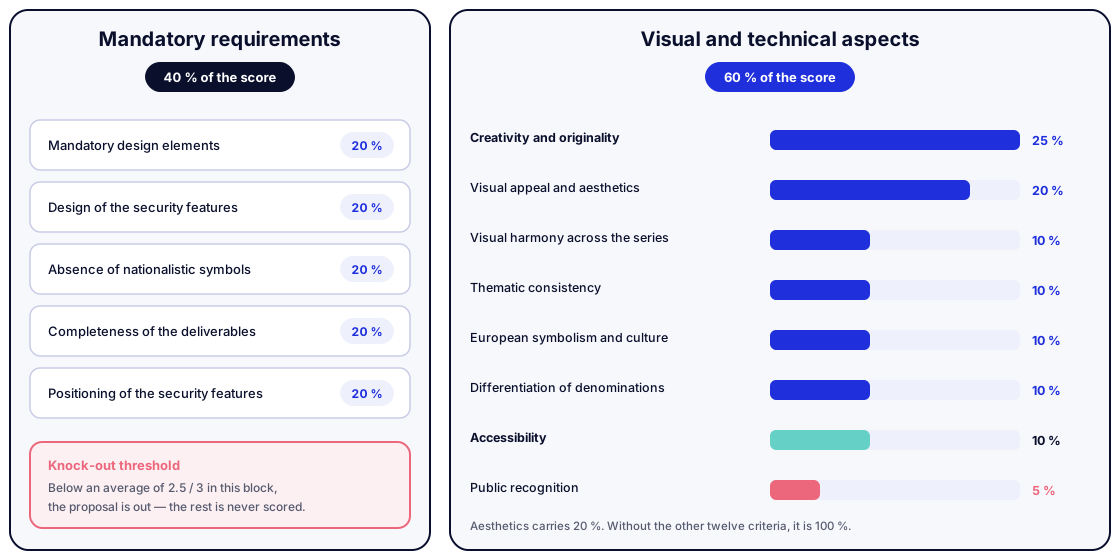
The first 40 % of the score is split equally — 20 % each — between five requirements with nothing subjective about them:
- Including the mandatory design elements.
- Correctly designing the required security features.
- Absence of nationalistic symbols.
- Completeness of the deliverables.
- Correct positioning of the security features.
And now the important part: any proposal failing to average 2.5 out of 3 in this block was eliminated, however brilliant the rest of it was. In other words, creativity was not scored until the proposal had proved it was manufacturable, compliant and complete.
Anyone who has ever presented a brand identity recognises the inverse scene: the studio that turns up with a gorgeous proposal and no system, no variants, and none of the applications the client explicitly asked for. The ECB simply decided that sort of thing does not even get looked at.
Block 2: eight visual and technical criteria
The remaining 60 % does enter design territory, and the weights are revealing:
| Criterion | Weight |
|---|---|
| Creativity and originality | 25 % |
| Visual appeal and aesthetics | 20 % |
| Visual harmony across the series | 10 % |
| Thematic consistency | 10 % |
| European symbolism and cultural representation | 10 % |
| Differentiation between denominations | 10 % |
| Accessibility | 10 % |
| Public recognition | 5 % |
There are three things that always surprise a client when we show them a table like this.
Creativity is the heaviest single criterion. 25 %, more than aesthetics. In an object as tightly regulated as a banknote, with fixed positions and explicit prohibitions, the jury chose to reward the idea above everything else. Not the pretty execution: the idea.
Accessibility carries the same weight as European symbolism. A 10 % decided on contrast, numeral size, tactile elements and colour differentiation for people with low vision. In most branding projects that reach a studio, accessibility has no percentage weight because it is not in the brief: it gets checked at the end, once the palette can no longer change. Here it is a scored criterion.
Public recognition is the smallest criterion of all. 5 %. That is a striking call for an object hundreds of millions of people will handle, and it has a sound explanation: recognition is built through time and mass distribution, not measured in a jury room. What the ECB is effectively saying is that familiarity is earned afterwards. It is the exact opposite of the usual client reflex, which wants a brand-new identity to feel familiar on day one.
Designing under brutal constraints
A banknote is probably the piece of graphic design with more simultaneous constraints than any other. They are worth listing, because each one has a softer equivalent in an ordinary branding project.
No nationalistic symbols. This is the most interesting constraint and the most misunderstood. It is not political correctness: the brand belongs to twenty countries and none can sit above the rest. It is why today's notes show generic architecture instead of recognisable buildings. Translated to a normal project: when a brand belongs to several partners, markets or business lines, any element that visibly favours one becomes a political problem the design will end up paying for.
Six denominations that must look like family and be told apart. The series runs from the 5 to the 200 euro note. They have to read as one system (visual harmony, 10 %) and be unmistakable from each other (differentiation, another 10 %). Those are two forces pulling in opposite directions, and that is exactly where the elegance of the solutions lives. Ville Tietäväinen's Finnish proposal solves it with an idea we rate as one of the best in the set: the river advances across the series, and the higher the denomination, the closer to the sea the image sits. The progression of value stops being a bigger number and becomes a journey. That is a design system, not a collection of pieces.
Security features go exactly where they have to go. Foils, watermarks, optically variable elements: positions and sizes fixed in advance, and scored twice in the mandatory block (once for designing them well, once for putting them where they belong). The designer does not negotiate those zones — they compose around them. And the bar to clear is high: in 2025, 444,000 counterfeit notes were withdrawn from circulation, 20 % fewer than the year before, leaving the rate at just 14 fakes per million genuine banknotes. The new series has to be redesigned from scratch without making that number worse.
Tietäväinen's solution is instructive again because it does not merely dodge the foil, it uses it as narrative support: the river's phases live inside the security element. Turning a limitation into the place where the idea happens is the difference between satisfying a brief and actually designing.
It cannot change size or colour. This is the least glamorous constraint and the most decisive. The six denominations keep their current dimensions and dominant colour — grey for the €5, red for the €10, blue for the €20, orange for the €50, green for the €100, yellow for the €200 — and not out of nostalgia: changing the millimetres would mean physically redesigning the cassettes, rollers and sensors in millions of ATMs, vending machines and cash recyclers across Europe, at a cost of billions to the sector. Translated to an ordinary project: a redesign inherits the client's infrastructure. Whatever breaks their email template, their signage estate or their packaging die is not a design decision, it is a budget.
It has to work for people who cannot see well. And for people handling it in the dark, and for people counting it fast at a till. A banknote is used in poor conditions by definition. What stands out is how far back this goes: the ECB has worked with the European Blind Union since 1997, before the first euro existed, and it was that collaboration that produced the decision to make banknotes grow in size as their value rises. That detail you take for granted when pulling money out of your wallet is an accessibility decision taken almost thirty years ago, and it still constrains all ten shortlisted studios today, alongside the intaglio reliefs along the edge, the saturated colour contrasts and the "feel, look and tilt" method. Accessibility was not bolted on at the end of the process: it was the first thing written down, which is why it sits in the series' DNA rather than in a review.
And then materials and durability. The ECB has stated that the new series aims for greater durability, more sustainable materials and improved production processes. That front has figures of its own: the ECB's environmental footprint study put the annual impact of one citizen's banknote use at the equivalent of driving 8 kilometres, and found that making the paper accounts for just 9 % of the total, against 37 % for ATMs and 35 % for transport. The design then arrives at an industrial press that imposes constraints of its own.
To all of which add the constraint we like most: the design had to defend itself. Pseudonymised, with nobody there to explain the intent behind it. If your identity needs you standing in front of it narrating for it to make sense, you have a problem no presentation is going to fix.
Neurodesign: the criterion that never made the table
Among the 21 jury members there was one profile that does not fit the usual line-up for a graphic design contest: a professor of Experimental Psychology. Juan Lupiáñez, of the University of Granada, joined on the nomination of Banco de España to assess the proposals through cognitive neuroscience. It is the first time the ECB has brought that discipline into the process, and it says a fair amount about how aesthetics were judged here.
The problem it addresses is very specific. A banknote is processed under terrible attention conditions: in a queue, hands full, looking at something else, in under a second. In that instant the user has to answer three questions at once — what it is worth, whether it is genuine and which way up it goes — and every graphic element you add charges a toll. That is cognitive load: the mental effort an interface demands in order to do its job.
And there sits the underlying tension of the whole project: security and usability pull in opposite directions. The more armoured a banknote is — microtext, guilloches, overlaid patterns, iridescent varnishes — the more visual noise it accumulates, and that noise competes with precisely what the user needs to read first. The role of neurodesign is to make sure the hierarchy survives that pressure: that the numeral and the main motif register pre-attentively, before the eye decides to look, and that the anti-counterfeiting apparatus stays in a second plane that is checkable but not intrusive.
The argument is worth finishing from the side that looks counterintuitive: a banknote you can validate at a glance gets checked more often; one that demands you stop and study it never gets checked at all. Usability is not the opposite of security — it is its precondition.
If you work in interfaces, this will sound familiar. It is exactly the reasoning used against a product page carrying six notices, four trust badges and two pop-ups: every element you add to reinforce the message takes attention away from the message. The difference is that the ECB turned it into a criterion assessed by a specialist, whereas most branding projects leave it to the eye of whoever is directing.
The Spanish entry: the gaze and the hidden letters
Among the ten finalists there is one Spanish proposal: the joint entry from studios Rubio & del Amo and Cruz más Cruz, competing in the European culture theme.
Their approach starts from a central gaze that addresses whoever is holding the note, setting up a dialogue between historical figures and Europeans today. The series holds together through consistent colour and linear patterns that supply texture, and the jury described it as innovative and well-researched as a communication vehicle.
It is also, as noted above, the only proposal in the culture theme that turns the banknote vertical, and the argument they defend it with is not aesthetic but functional: a banknote is handled vertically. It comes out of the wallet vertically, it goes into a validation machine vertically, and it reaches hands trained for fifteen years by a phone screen. The horizontal orientation of Western paper money is an inherited convention, not a conclusion about how the object is used. It is exactly the kind of question a redesign almost never asks — is this like this because it works, or because it has always been like this? — and here it produces the most visible difference in the entire contest.
The decision earns its keep compositionally too: in portrait format the face occupies the note's long axis and the gaze sits at eye level for whoever is holding it. On the 5 euro note, with Maria Callas, the face is further sliced into horizontal bands that shift slightly against each other, like a print that never quite registers. It forces you to reassemble the face mentally, and that small effort is exactly what makes it stick.
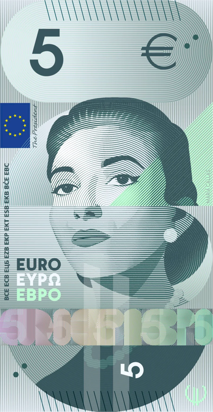
The detail we like most is a different one. Turn the note horizontal and the blocks of the composition reveal the letters E-U-R-O. It is an art direction device that works in two beats: first you see a portrait, then you discover a word. And it works precisely because it does not announce itself.
It is worth pausing on why this is more than a gimmick. A banknote is an object people look at thousands of times over years, almost always without paying attention. A detail that only surfaces when you change the orientation rewards a second look without getting in the way of use: nobody needs to discover it in order to buy bread. In brand identity, that is the definition of a good hidden detail — and also the test that rules out 90 % of the ones proposed. The bad easter egg is the one you have to explain in the guidelines for anyone to notice. The good one is the one people find by themselves and then tell someone about.
And there is a coincidence that reads on its own in Spain: one of the two studios behind the proposal is Cruz más Cruz, which links directly to José María Cruz Novillo, author of the final peseta series. The design aiming to renew the euro that replaced the peseta comes, in part, from the same graphic family.
What we take from this into a branding project
No brand we design will ever have 1,241 candidates or a jury of 21. But the method is stealable, and these are the six pieces we take.
1. Write your decision criteria before you see the first proposal. This is the only genuinely important thing in this article. The ECB defined thirteen criteria with numerical weights and a knock-out threshold, and it did so before it had anything to judge. When criteria are written afterwards, they are not criteria: they are a justification for what had already been decided. And yes, this works on a small project too: five criteria with a weight each, on half a page, signed off before the first presentation.
2. Separate the knock-out from the debatable. Some things are not scored, they are met: the logo working at 16 pixels, a monochrome version existing, contrast passing AA, the agreed applications being delivered. All of that belongs in a prior block with a threshold. What comes after — the idea, the tone, the personality — is where discussion actually makes sense.
3. Define the territory before the logo. The ECB picked two themes in 2023 and did not start looking at designs until 2025. Territory first, form second. Most branding projects that stall do so because a symbol is being argued over when there is in fact no agreement on what the brand wants to say.
4. Design the system, not the piece. Six denominations that are family yet unmistakable is the same problem as a brand with five service lines, or a website with nine page types. The acid test is simple: put every piece on a wall together. If they do not look like the same family, there is no system. If they cannot be told apart, there is no system either. It is the same reasoning we apply to designing a site around blocks and hierarchy: coherence is proved collectively, never on one isolated screen.
5. Accessibility is an entry requirement, not a final review. If it carries 10 % of the score and is assessed from the start, it shapes the palette and the typography while both can still change. If it is checked at the end, what you get is a patch. This applies equally to an identity and to an interface: contrast and minimum sizes are decided in the definition phase, not in layout.
6. Count what the user has to process, not just what you want to say. This is the neurodesign lesson and the most widely ignored one. Every notice, badge, gradient or piece of microcopy you add competes for the same attention as the main message, and the result of stacking reinforcements is usually a weaker message. The useful question is not "does this look good?" but "what does someone glancing at this for a second have to work out, and am I helping or getting in the way?".
And one lesson in the negative, the one that saves us most argument in meetings: "I like it / I don't like it" is the worst method of evaluating identity there is. Not because taste does not matter — it carries 20 % in the ECB's rubric, which is not nothing — but because without the other twelve criteria around it, the taste of whoever holds the most seniority becomes the only criterion. The value of a rubric is not that it removes subjectivity. It is that it puts subjectivity in its place and assigns it a percentage.
How we work at yuGraphik
In our visual identity projects we start with the territory: what the brand says, to whom and against whom, before anything gets drawn. Out of that comes a short document with the criteria the proposals will be judged against, agreed with the client before the first presentation. It is not bureaucracy: it is what turns the presentation meeting into a decision rather than a conversation about taste.
After that we build a system, not loose pieces: logo variants, a palette with verified contrast, a type scale and the real applications the project needs, from favicon to stationery. And since that identity almost always ends up living on a screen, we work it alongside web design from the outset, with accessibility and performance inside the brief rather than in the final review.
Conclusion
The banknotes we eventually end up using will come from one of these ten proposals — and whichever theme loses will teach the ECB something for next time. Honestly, we do not know which we prefer: Tietäväinen's river journey strikes us as the best-resolved system, and the gaze in the Spanish proposal as the best art direction find. We have until 21 September to make up our minds, like everyone else.
What we are sure of is that the most valuable document the ECB published this month is not the design viewer: it is the jury report. Thirteen criteria, a set of weights, a knock-out threshold and a blind assessment. None of those four things is arbitrary, and all four can be applied to a branding project of any size next week.
About to decide on your brand's identity and still have nothing written down about the criteria you will use to choose? Take a look at our projects or let's talk about yours.
Frequently asked questions
When will the euro banknotes change?
There is no changeover date yet, and the dates going around are worth treating with caution. The ECB expects its Governing Council to pick the winning design around the end of 2026. After that, the chosen design has to be developed, tested and adapted for industrial production, and the ECB has given no year for any of it. Its press release says only that banknotes from the new series are expected to enter circulation in subsequent years, and its FAQ specifies that no decision has yet been made on when and how they will be put into circulation. The 2027 and 2028 dates appearing in the press are estimates, not an official calendar.
Will the current banknotes stop being valid?
No. Today's euro banknotes will remain legal tender and can be used as normal. When a new series enters circulation, the previous one is withdrawn gradually as old notes return to the national central banks, and the two coexist for years. Euro banknotes also never expire: even once they stop being legal tender, the national central banks of the euro area exchange them with no time limit.
How can I vote on the new banknote designs?
On 23 July 2026 the ECB opened a public survey on its website where anyone can view the ten shortlisted series and give their opinion. The survey is open until 21 September 2026. In parallel, an independent research company is running a survey on a representative sample of the euro area population, so that the result does not depend solely on who chooses to take part online.
Does the public vote decide the winning design?
Not exactly. The survey is not a binding referendum: it gathers public opinion as one of the inputs that will be taken into account. The final decision rests with the ECB's Governing Council, expected around the end of 2026. That distinction matters, because the winning design also has to pass production and security testing that a popular vote cannot assess.
What are the two themes for the new banknotes?
The ECB selected two shortlisted themes in 2023 and has kept both through to this stage. The first is European culture, built around shared cultural figures and spaces across the continent. The second is Rivers and birds, which travels through European river landscapes and the bird species associated with them. Only one of the two themes will make it onto the banknotes: the five shortlisted series in each theme compete against each other and against the other theme.
Why can't euro banknotes carry national symbols?
Because they are the shared currency of twenty countries and none of them can be represented above the others. The absence of nationalistic symbols is not an aesthetic recommendation: it was one of the five mandatory contest requirements, weighted at 20 per cent within the knock-out block. A proposal featuring a monument identifiable with one specific country was disqualified. It is the same reason today's banknotes show generic architecture rather than real buildings.
Who chose which figures and which birds appear on each banknote?
The ECB did, not the designers. Comparing the proposals in the official viewer makes it obvious: Maria Callas occupies the 5 euro note in every European culture proposal, and the wallcreeper occupies the 5 euro note in every Rivers and birds proposal, with the European Parliament on the reverse. The figures, the species and the institutions were part of the mandatory design elements set out in the brief, worth 20 per cent within the knock-out block. All each studio decided was how to treat that content, not what the content was.
Which historical figure or which bird goes on each banknote?
The ECB fixed the allocation in advance and it is identical across every proposal. In the European culture theme: Maria Callas and the performing arts on the 5 euro note, Ludwig van Beethoven and music on the 10, Marie Curie and universities on the 20, Miguel de Cervantes and libraries on the 50, Leonardo da Vinci and museums on the 100, and Bertha von Suttner and public squares on the 200. In Rivers and birds, from the lowest denomination up: wallcreeper, kingfisher, bee-eater, white stork, avocet and northern gannet, with a different European institution on each reverse.
What does neuroscience have to do with banknote design?
It measures cognitive load: the mental effort required to identify a banknote's value, authenticity and orientation in under a second and under poor attention conditions. The ECB added Juan Lupiáñez, professor of Experimental Psychology at the University of Granada, to the jury on the nomination of Banco de España, specifically to assess that dimension. The conflict it resolves is real: the more anti-counterfeiting features you add, the more visual noise competes with what the user needs to read first.
Will the new banknotes change size or colour?
No. The ECB is keeping the six current denominations at their existing dimensions and dominant colours: grey for the 5 euro note, red for the 10, blue for the 20, orange for the 50, green for the 100 and yellow for the 200. The reason is industrial: changing the millimetres would force a physical redesign of the cassettes, rollers and sensors in millions of ATMs, vending machines and cash recyclers across Europe, at a cost of billions to the sector.
Are there Spanish designers among the finalists?
Yes. One of the ten shortlisted proposals, identified as design G and entered in the European culture theme, is the work of the Spanish studios Rubio & del Amo and Cruz más Cruz, who worked together. Their proposal is built around a central gaze that invites dialogue between historical figures and Europeans today, and it hides a typographic detail: turn the banknote horizontal and the blocks of the composition reveal the letters E-U-R-O.
Who designed the current euro banknotes?
Austrian designer Robert Kalina, of the Oesterreichische Nationalbank, won the 1996 contest with the windows, gateways and bridges series we know today, based on generic European architectural styles rather than real buildings. The Europa series, adapted by German designer Reinhold Gerstetter and rolled out between 2013 and 2019, updated the security features and adjusted the colours but kept the same visual concept. That is why the redesign now under way is the first real change of theme since the euro was introduced in 2002.