Web design in 2026 cements an idea we've championed for years: aesthetics and performance aren't enemies. The websites that stand out this year combine strong visual personality with impeccable load times. These are the trends we see working in real projects, and the ones starting to wear users down.
What works
1. Bento grids with real hierarchy
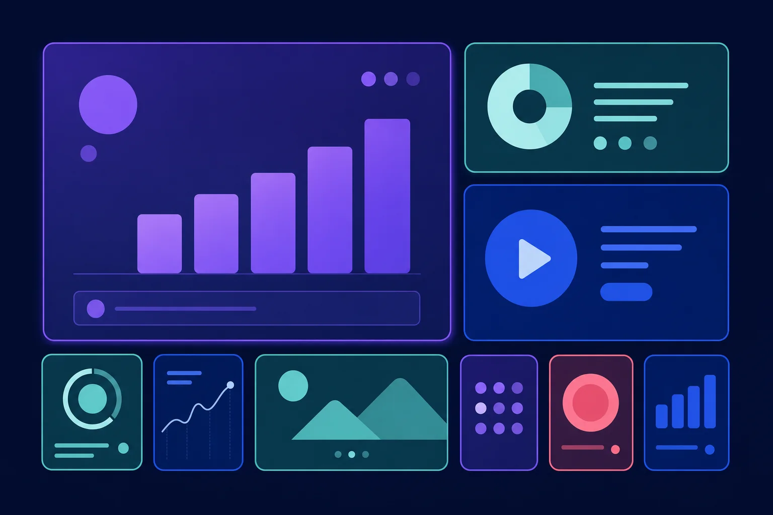
The "bento" grid —blocks of different sizes that organise heterogeneous content— has gone from novelty to standard. Its success has a simple explanation: it lets you show a lot of information without the page looking like a cluttered brochure.
The key is hierarchy. A bento grid works when the size of each block reflects the importance of its content. When every block carries the same visual weight, the user doesn't know where to look.
2. Typography as the main attraction
Huge headlines, variable fonts and expressive typographic compositions are replacing stock photography in website heroes. It's a logical evolution: type weighs less than an image, adapts better to any screen and communicates brand identity more directly.
In our projects we use variable fonts whenever the design allows: a single file covers every weight and reduces network requests.
3. Micro-interactions with purpose
A button that responds to hover, a form that validates in real time, a transition that shows where content is coming from. Well-crafted micro-interactions make a site easier to understand, not just prettier.
The acid test: if you remove the animation and the interface reads just as clearly, that animation was decorative. That's not necessarily bad, but it should be lightweight and respect prefers-reduced-motion.
4. Mature dark mode
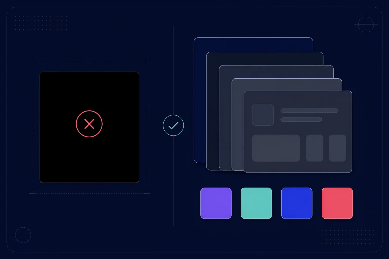
Dark mode has stopped being a switch that inverts colours. Serious implementations in 2026 design a specific palette for the dark background: pure blacks are replaced by deep greys, accent colours are slightly desaturated and shadows are rethought as borders and elevations.
What's starting to wear thin
Not everything that wins on Dribbble survives contact with real users. These are the trends that, in production, tend to create more friction than they're worth:
- Heavy custom cursors that chase the pointer with a lag. They can work on creative portfolios; on business sites they get in the way of reading and fall apart on mobile, where there's no pointer at all.
- Aggressive scroll-jacking: hijacking the mouse wheel to force animations breaks the user's most basic expectation. Scrollytelling only works when the user keeps control.
- Glassmorphism by default: translucent panels with blur consume GPU and, used without criteria, drop contrast below accessibility minimums.
Trends and performance: the balance
Every aesthetic decision has a technical cost, and in 2026 that cost is measured: Google evaluates your site's Core Web Vitals and users abandon pages that are slow to respond. The research backs it up: according to Google and Deloitte's Milliseconds Make Millions study, a mere 0.1s improvement in mobile load speed lifted conversions by up to 8% in retail and 10% in travel. Our rule on every project is simple: no trend ships to production if it worsens LCP or INP.
This doesn't mean giving up personality. It means implementing it well: animations in CSS before JavaScript, images in WebP/AVIF with responsive sizes, variable fonts with font-display: swap, and JavaScript only where it adds value. If you want to measure and optimise these metrics yourself, we walk through it step by step in our practical Core Web Vitals guide.
Conclusion
The trends of 2026 reward those who design with intent: clear hierarchy, typography with character, interactions that communicate and performance as a starting requirement. If your site needs an update, it's not about applying every trend, but about choosing the ones that reinforce your brand.
Does your site need a refresh that adds personality without sacrificing speed? At yuGraphik we combine web design and web development to achieve exactly that. Take a look at our projects or let's talk about yours.
Frequently asked questions
Do I have to redesign my website every time trends change?
No. Trends are a reference, not an obligation. A well-designed website with a strong identity ages far better than one chasing every fad. The sensible approach is to review the design every 2-3 years and update it when it stops representing your brand or converting.
Do animations hurt SEO?
Only if they're poorly implemented. CSS animations and lightweight micro-interactions don't affect rankings. The problem appears when they block rendering or inflate LCP. The key is to animate with purpose and measure Core Web Vitals before and after.
Is dark mode essential in 2026?
It's not essential, but users appreciate it, especially on sites browsed at night or during long sessions. If you implement it, do it properly: with a dedicated palette for the dark background, not just by inverting colours.