Rarely do so many big web redesigns land in such a short window. Between January and August 2026, Stripe, Airbnb, YouTube, Xbox, Google, Apple, Netflix, Tinder, Coca-Cola and Instagram all rebuilt their digital design, and not with cosmetic touch-ups: homepages rebuilt from scratch, new typefaces, new motion systems and, in several cases, an aesthetic change of direction that breaks with the previous decade. Along the way there were also two loud failures, which is where most of the learning is.
Here's the summary of what changed, with dates and credits:
| Brand | Date | What changed | Who signed it |
|---|---|---|---|
| Stripe | 2026 | Homepage rebuilt, the first in six years: bento grid, live GDP counter and modals instead of new pages | In-house (Katie Dill) |
| YouTube | 20 January | Custom typeface, new illustration framework and its first motion identity system | YouTube Creative Studio, with Sharp Type |
| Xbox | 23 April | «Microsoft Gaming» retired and the green sphere returns, now with a glass treatment | Microsoft |
| Spotify | 14 May | Disco-ball anniversary icon. Reverted within days after user rejection | Spotify |
| Google Workspace | 18 May | Icons with gradients and a dominant colour: the four-colour rule falls | |
| Apple | 8 June | Liquid Glass corrections and a transparency control for the user | Apple |
| Netflix | June | Web interface refresh, in testing: rounder tiles and contextual tags on box art | Netflix |
| Tinder | 17 July | All-caps wordmark, serif headlines and the swipe turned into a motion system | Porto Rocha |
| Coca-Cola | 20 July | A single visual system for more than 200 markets, with its own Brand Center | Coca-Cola |
| 13 August | First wordmark change in ten years: the script falls and three typefaces arrive. The icon is untouched | Meta design team | |
| Airbnb | 2026 | From accommodation search engine to services and experiences platform, with listings rewritten for AI agents | In-house |
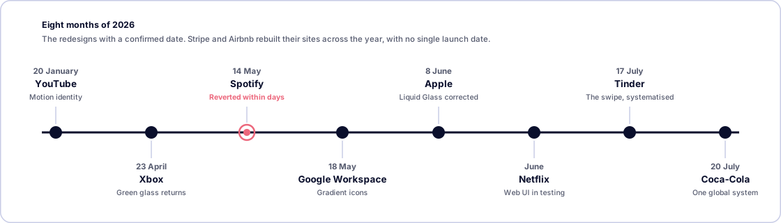
If you're after the broader picture, we cover it in web design trends 2026. This article goes to the specifics: exactly what changed in each case, and which patterns repeat. Because the interesting part isn't any single brand's logo: it's that very different teams arrived, at roughly the same time, at similar conclusions about how a digital product should look and work in 2026.
2026, the year flat design stopped being the default
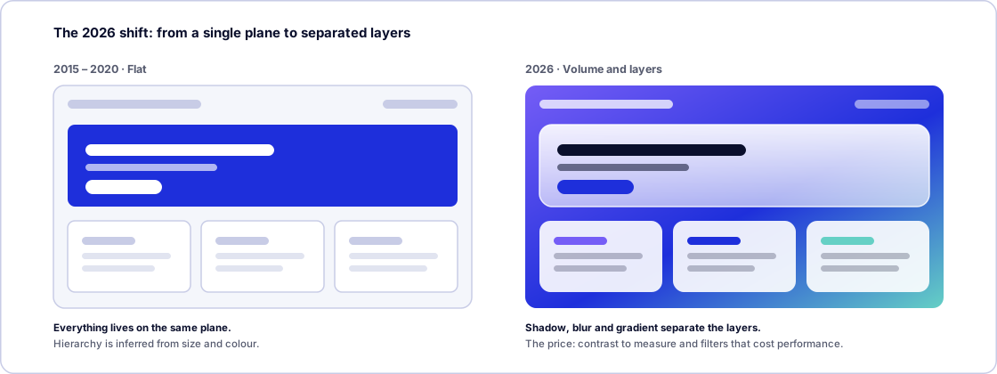
For nearly fifteen years, interface design moved in one direction: remove. No shadows, no textures, no gradients, nothing that imitated a physical object. The result was a decade of near-interchangeable flat logos and interfaces clean to the point of indifference.
In 2026 the direction reversed. This year's redesigns bring back volume, gloss and depth, and they do it with a specific intent: separating layers. When a brand lives simultaneously on a phone, a 65-inch television, a console and a pair of glasses, flat design stops helping you understand what sits on top of what. Glass and gradient, badly used, are decoration; well used, they're hierarchy.
But the year isn't only about aesthetics. It's also about websites rebuilt for business reasons, and about a European regulation that pushed companies into redesigning when they had no intention of doing so.
The actual website redesigns
Stripe: a year of work for a single page
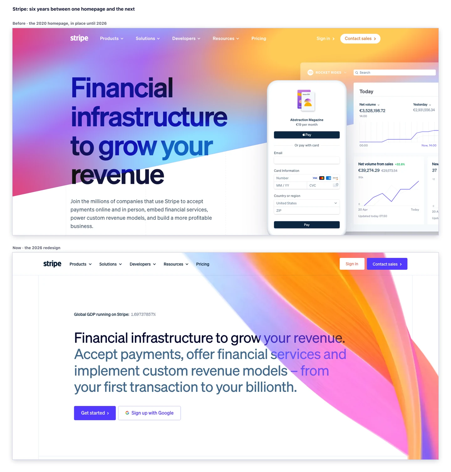
Stripe's homepage redesign is by some distance the most instructive case of the year for anyone who builds websites. It was the first in six years, led by Katie Dill, the company's head of design, and it ran for more than a year. The process is told in detail by Dill herself in Y Combinator's library.
The starting problem is the most common one in the world, only at Stripe's scale: the previous site, from 2020, had accumulated patches and additions until it became an endless scroll that diluted the message. And the audience had split into two hard-to-serve extremes: from the freelancer who wants to get paid via a link, to the multinational that needs a complete financial architecture.
The specific decisions are worth attention:
- A bento grid to present the product lines (payments, billing, card issuing, AI) without forcing the user to read vertically for ten screens.
- A live GDP counter at the top, quantifying in real time the economic volume processed through the platform. That's a trust decision, not a decorative one: it replaces three paragraphs of argument with a number that moves.
- Modals and overlays instead of new pages for each product's detail, so going deeper doesn't mean losing context or changing URL.
- Accordions were discarded after user research: people preferred to explore without having to click constantly to see what was inside.
The most-quoted part, though, is how they used artificial intelligence. The team used it to explore prototypes at speed —twenty concepts in the time that used to yield two— but with strict human curation at every stage, because generated output carries detail and lighting defects they internally call slop. They went as far as delaying a launch by a month until the transitions were genuinely intentional.
The lesson comes down to a line from Dill herself: a homepage isn't just a sales tool, it's a manifesto of a company's purpose. And to something more prosaic: AI speeds up ideation, human judgement defines the result.
Airbnb: from accommodation search to travel companion
Through 2026, Airbnb restructured its web and mobile architecture to stop being an accommodation search engine and become what the company calls a «travel companion»: homes, services and experiences coexisting at the same level, with the trips tab turned into a living itinerary rather than a list of reservations.
Two data points explain the context. The first came from Brian Chesky in the first-quarter earnings call: close to 60% of the code the company produces is now generated by AI agents, roughly double the industry average. The second is about content design, and it's the one that should matter most outside Airbnb: the platform reorganised the semantic structure of its listings so conversational agents can interpret them, penalising generic bullet-point descriptions and rewarding descriptive narratives a model can match to a searcher's intent.
It's the same logic we explain in our guide to AI SEO, applied to a product listing: content is no longer written for people alone.
Netflix (June): the redesign that gets tested before it ships
In June it emerged that Netflix was testing a refresh of its web interface with a limited group of users, after overhauling its television and mobile apps over the previous two years. The changes: rounder tiles with snappier animations, a gradient background that responds to the featured title, contextual tags over box art («new season coming», «recently added», «highly rewatched») and a games row promoted to second position. The overall structure and the category pages stay as they were.
What's interesting here isn't the design, it's the method. Netflix doesn't launch redesigns: it tests them for months, in specific markets, measuring behaviour before generalising. Its previous overhaul, the television interface, shipped after a year of beta testing across several markets and arrived with a data point in hand: more users preferred the new design to the old one. It still generated a wave of public complaints at launch, which is perfectly compatible with the usage metrics being better. The initial noise around a redesign and its actual performance are two different things.
The identities that changed
YouTube (20 January): the first motion identity
YouTube opened the year with the most ambitious brand redesign, coinciding with its twentieth anniversary. The striking part wasn't the logo —red, black and white stay— but everything else.
The platform introduced YouTube Display, a custom typeface developed with the foundry Sharp Type from the geometry of the logo itself and supporting nine writing systems, a new illustration framework created with Gesture Systems and, above all, its first formal motion identity system, built from scratch by the in-house YouTube Creative Studio team.
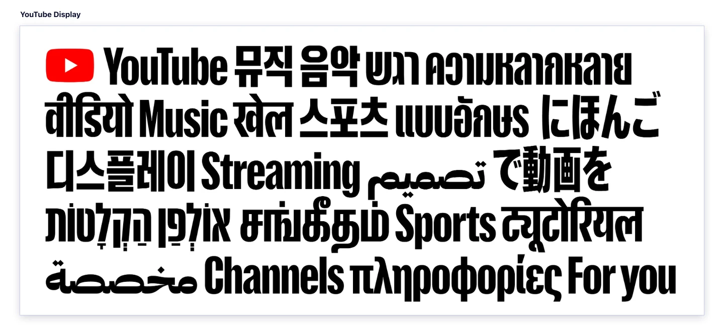
That motion system is the part that should most interest anyone designing digital products. It isn't a pretty animation for a TV ad: it's a set of rules for how brand elements move, built to scale across web, iOS, Android, connected televisions, consoles and connected devices. It includes details as specific as a slight camera shake that mimics the natural movement of creator content.
The stated goal was to stitch together an ecosystem that had drifted apart: Shorts, Music, TV, Premium and Kids had diverged in design and tone. Designer Kieran Mistry put it well in the announcement: «when a brand lives everywhere, it risks feeling like nowhere». The aim was «a system that connects its many sides — unified but never uniform».
Xbox (23 April): green glass and the end of «Microsoft Gaming»
Microsoft retired the «Microsoft Gaming» brand and put Xbox back at the centre, under the «We Are Xbox» umbrella. The visual change was just as decisive: the flat black-and-white logo the brand had carried since 2019 gave way to a luminous green sphere with a glass treatment, with shading, reflections and an emerald glow that brings back the original green of the 2001 console.
It is, technically, a return to skeuomorphism: an object that behaves as if lit by a studio light. And it's built for large canvases. On a 4K store panel or a console background, the reflection works and lifts the mark off the black field; in a 16-pixel favicon, that same detail disappears. It's the kind of decision that only makes sense when you know which surface your brand will live on most of the time.
The rollout was fast: by 1 May the new logo was available on Series X|S as a dynamic background, profile theme and gamerpic.
Google Workspace (18 May): goodbye to the four-colour rule
Google made the quietest change, and probably the one seen by the most people. After leaking in previews in late April, on 18 May it began rolling out a completely new icon system for Gmail, Drive, Docs, Sheets, Slides, Calendar, Chat, Meet, Vids, Forms, Keep, Voice and Tasks: first in the web launcher and Chrome's new tab, then on iOS (completed 26 May) and finally on Android, completed 4 June.
The substantial part isn't the gradients, it's the rule being broken: Google is abandoning the norm that defined the previous era, under which almost every icon had to carry all four brand colours. Now each icon has a dominant colour, soft gradients and rounder geometry producing a subtle three-dimensional effect.
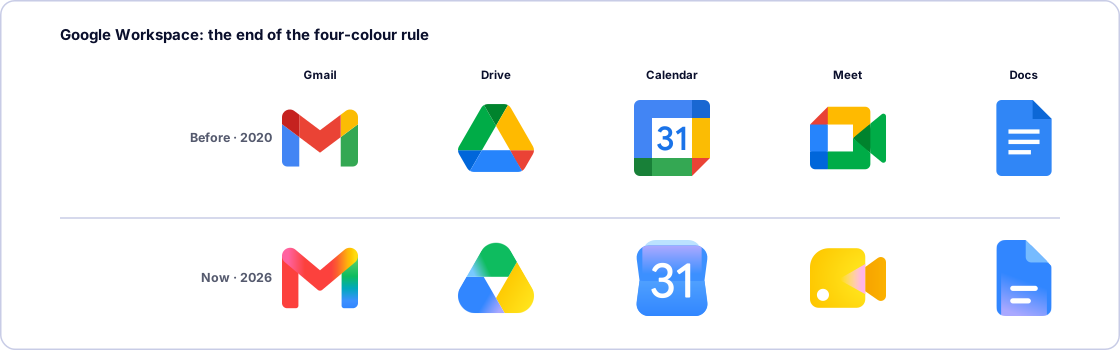
It's a change with a trade-off. The icons gain individual personality and lose some instant recognition as a family: Drive, for instance, loses the red that identified it. It's the same dilemma that shows up in any brand system with many products, only at the scale of billions of users.
Apple (8 June): Liquid Glass backs down
Apple didn't redesign anything new in 2026: it corrected what it had shipped in 2025. Liquid Glass, the translucent visual language of iOS 26, iPadOS 26 and macOS 26, had drawn persistent criticism over legibility —text over backgrounds that show through, insufficient contrast, elements competing with content—. On 8 June 2026 Apple announced improvements and, above all, a transparency slider letting users tune the effect from «ultra clear» to fully tinted.
The paradox is worth noting: in May 2026, Liquid Glass won a Gold Cube at the Art Directors Club of New York awards, part of a haul of six for Apple. A design can be awarded and still need an accessibility fix. Those aren't contradictory, and that's exactly the lesson: the visual effect is an art-direction decision; legibility is not negotiable. When they clash, the elegant way out is handing control to the user, not defending the effect.
Tinder (17 July): the brand as a character
Tinder unveiled its first identity redesign in almost ten years, signed by the studio Porto Rocha. It swapped the lowercase logo for an all-caps TINDER, sharpened the flame's silhouette, widened the palette —reds, pinks, blues and greens, to represent a broader emotional spectrum than romance— and brought in a serif for headlines, a notable turn in a category dominated by rounded sans-serifs.
Two decisions stand out. First: Tinder took its signature gesture, the swipe, and turned it into the basis of a motion system applicable across all digital communication. It's the same move YouTube made, from a different starting point. Second: the brand introduced «T», a fictional character cast as a dating columnist, tasked with holding the tone of voice inside the app. It's a risky bet —brand characters age badly if you don't feed them— but it solves a real problem: an app's tone of voice dissolves the moment twenty different people are writing it.
Coca-Cola (20 July): one system for more than 200 markets
Coca-Cola's move wasn't aesthetic, it was about governance. The company presented a single global visual system covering packaging, retail environments, equipment and digital experiences across more than 200 markets, rolling out first in Latin America, Europe, the Middle East and Asia. The elements are the usual ones —the Dynamic Ribbon, the Arden Square, the Spencerian script, the red and white— but for the first time with a single shared definition. Coca-Cola Zero Sugar is differentiated by larger «Zero Sugar» type, a black ribbon and a black cap on PET bottles.
Arnab Roy, president of Coca-Cola Global Category, put it plainly: «this refresh is about being clearer and more consistent in how we show up, wherever people experience our brand». And Rapha Abreu, global VP of design: «now, with one seamless visual identity, we can deliver one recognisable brand experience».
The piece almost nobody has commented on is the most interesting for anyone working in design: alongside the system, Coca-Cola launched a Brand Center and «Design Intelligence» tools to maintain consistency between internal teams and agency partners. In other words, the deliverable wasn't a PDF manual. It was infrastructure.
Instagram (13 August): the name changes, the icon doesn't
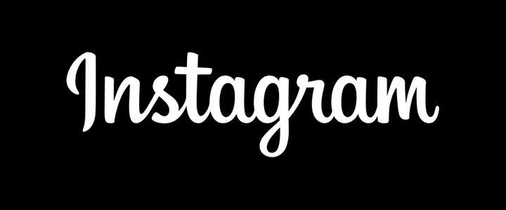
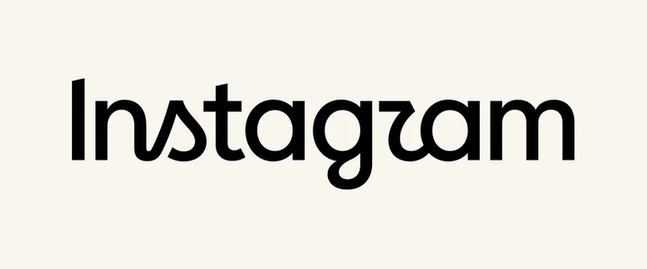
The summer's final redesign landed on 13 August, when Adam Mosseri unveiled on Instagram and Threads the first change to the platform's wordmark in ten years. The full script the brand had carried since 2016 disappears, giving way to a hybrid: lowercase print letterforms, more compact and heavier, with script traces kept only on the «s», the «r» and the «g». The loops close, the shapes square off, and the flourishes are concentrated in those three letters.
The important part isn't what changes, it's what doesn't get touched: the app icon stays exactly as it was. The gradient square Instagram launched in 2016 and adjusted in 2022 is still in place.
2016 · Full script
2026 · Print with script traces
The wordmark is only the tip of a wider system, detailed by Meta's design team:
- Three typefaces. Instagram Sans —the family the brand created in 2022 with Colophon Foundry— arrives updated, and two new ones join it: Instagram Pen, a handwriting face, and Instagram Mono, a monospace.
- The gradient carries less weight. It's still the identity's central asset, but it's applied «with a lighter touch» rather than saturating every surface.
- Motion, layout and interface refreshed, with the stated goal of giving user content «more room to breathe».
The quotes from those responsible explain the intent well. Jasmine Probst, Instagram's director of product design, says the team tested hundreds of directions before coming back to where it started: «script reflects individuality, so referencing that felt right; the new wordmark is bolder and simpler, with touches of unexpectedness». May Hartono, director of brand design at Meta, closes it: «the refreshed brand system puts our community's creativity and self-expression front and centre».
The reaction, by contrast, was immediate mockery. The «r» is drawn with a closed, angular shoulder almost identical to the «g» right before it, and from there came the nickname that circulated for days: «Instagzam».
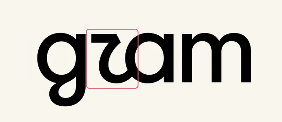
The «r» closes its shoulder
It is drawn with a closed, angular shoulder that mirrors the curve of the «g» right before it. The two letters share a silhouette and the eye reads them as a single shape.
Result: «gram» reads as «gzam».
Only three letters keep the script
The «s», the «r» and the «g» are the only ones that keep the handwritten stroke of the old logo. Everything else turns into print letterforms.
There were also comparisons with Jaguar and accusations of blanding —the Instagram logo starting to look like any generic fashion identity—, plus one argument with more substance: resting the brand's personality on script strokes is a curious choice just as younger generations are no longer taught to write in cursive.
Even so, it's worth separating the noise from the judgement. Compared with Spotify's case three months earlier, Instagram got the structural part right: the wordmark and the icon aren't playing the same game. The icon lives at sixteen pixels on a home screen and is processed by silhouette and colour in fractions of a second; the wordmark lives large, at the top of the feed, and gets read. Touching the second and leaving the first alone is exactly the right risk hierarchy. What is a real error, and not a matter of taste, is the ambiguity between the «r» and the «g»: when a logo makes you look twice to confirm what it says, the problem isn't that it's new, it's that it's less legible.
There's one more detail that fits that reading. Back in June, Instagram had already commissioned six artists —Zipeng Zhu, Uzo Njoku, Haruko Hayakawa, Humberto Cruz, Pablo Rochat and Felipe Pantone— to make alternative versions of the icon, available as an option for subscribers. The brand treats the icon as a surface you can play with by user choice, but it doesn't change the one the app ships with. It's a distinction any digital product can copy.
The rollout, moreover, is gradual: the wordmark shipped at once, but the rest of the system will be applied through 2026 across the app, the website and official materials.
And a few more
The year has delivered plenty beyond that. Threads replaced its Instagram Sans-derived wordmark in May with custom letterforms designed with Studio NARI. KFC presented a more flexible identity in June, built around the bucket and designed for digital platforms and social content. HONOR launched its «Ring of HONOR» symbol in July. 7UP arrived in August with a vertical logo and more saturated colours. Harley-Davidson returned its historic Bar & Shield to the centre of the brand in April.
Looked at together, the list has the feel of a cycle ending: in almost every case, what's being abandoned is a flat, minimal version adopted between 2015 and 2020.
The two failures that teach the most
Spotify (14 May): the logo that lasted a week
On 14 May, Spotify replaced the flat green circle in its icon with a mirrored green disco ball, hyper-detailed and retro-futuristic, which kept the three sound waves knocked out in black over the sphere, to mark its twentieth anniversary. The rejection was immediate and unusually large: users threatening to cancel, demanding whoever designed it be fired and, above all, people convinced the app was broken, still loading, or had installed malware. Spotify reversed within days, with a resigned message on X: «alright, we know glitter is not for everyone; our temp glow up ends soon».
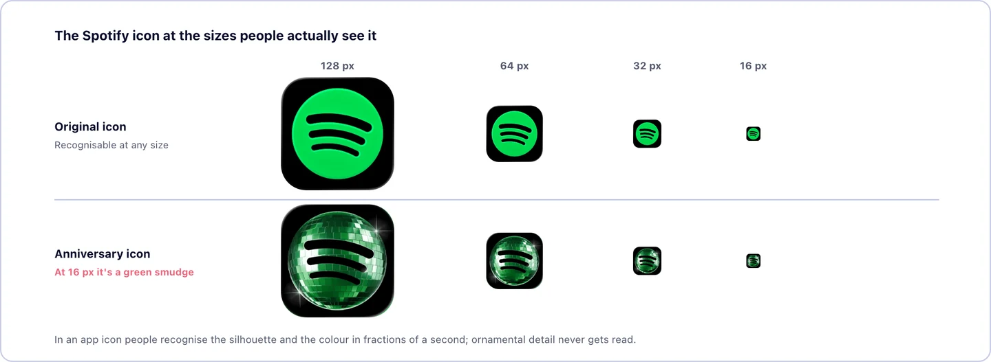
It's worth being fair: the change was always planned as temporary. What the reaction demonstrated wasn't that Spotify got the strategy wrong, but something more fundamental about how visual recognition works in 2026. Nobody reads a logo in an app icon. People recognise a silhouette and a colour in fractions of a second, and anything interfering with that reflex reads as a system error, not a design decision. A mirrored sphere with volume can be beautiful in a brand deck and turn into an illegible smudge at sixteen pixels.
The contrast inside the company itself is instructive: a month earlier, on 16 April, Spotify had launched a redesigned tablet app on iOS and Android that didn't just stretch the phone components but used the space with dual navigation to browse content while managing playback. That redesign, focused on utility and ergonomics, passed without noise and worked.
Jaguar: when you throw away brand equity
Jaguar's corporate redesign and new web ecosystem, under the «Copy Nothing» campaign, is the cautionary case of the year. In its transition to an all-electric range, the brand discarded the leaping cat and its inherited luxury aesthetic in one move, replacing them with a flat wordmark, experimental tech-flavoured typography and a palette of vivid, dissonant colours.
The backlash was historic. The analysis is simple to summarise: by modernising so aggressively, Jaguar erased all its recognisable codes and decades of accumulated visual equity at once, and the result landed in generic territory that alienated its customer base without being authentic enough to attract new ones. It's exactly the opposite error to Coca-Cola's, which spent its 2026 redesign reinforcing its long-standing assets rather than replacing them.
Financial services, where the change shows most
For years, financial web design was a byword for arid restraint, jargon and corporate blue. In 2026 that broke, and the sector has become the reference point for B2B design. The common thread: legal small print has stopped hiding in the footer. Compliance disclosures, audit results and regulatory data appear at the top, as a design element, turning bureaucracy into an aesthetic of authority.
| Company | Redesign approach | What it demonstrates |
|---|---|---|
| Wise | Functional transparency | The fee calculator is built into the hero itself. It demonstrates the value proposition without asking you to read a paragraph |
| Mercury | Editorial B2B luxury | Restrained palette, generous white space and editorial photography atypical for banking: the message is that your money is handled with couture-grade seriousness |
| Robinhood | Typographic edge | With Porto Rocha, it moves away from its initial disruptive aesthetic towards a «financial magazine» approach, with the custom Robinhood Phonic typeface and the «Robin Neon» colour |
| Coinbase | Institutional minimalism | Massive white space and a deliberate rejection of crypto neon, to project conventional fiduciary trust |
The detail running through the whole category is typographic. Söhne at Stripe, Wise Sans, Klarna Title, Aeonik Pro at Revolut, Robinhood Phonic: at the top of the sector, a typeface is no longer picked from a catalogue, it's commissioned as brand infrastructure.
Agencies, museums and institutions
Outside big tech, 2026 has left redesigns worth mentioning because they solve very recognisable problems:
- BBH carried out its first identity redesign in forty-four years, with Studio Drama: three custom typefaces and a three-dimensional moving glyph system, calibrated in Cavalry and After Effects, to embody its founding mantra («when the world zigs, zag»).
- 4Creative, Channel 4's in-house creative arm, built a collaborative logo system with more than one hundred and thirty variations designed by different team members: a modular, perpetually unfinished identity.
- Norton Museum of Art revived, with Koto, an eighty-year-old wordmark found in its archives. Tilting the «N» forty degrees gave them a graphic device that acts as a container for shapes and text paths across the site.
- European Forest Institute reorganised, with Soapbox, a labyrinthine forestry research database into two navigation modes, «Knowledge» and «Action», depending on whether the visitor comes to understand or to apply. It's a lesson in information architecture: sometimes the problem isn't the content, it's that there aren't two distinct routes into it.
- Wikimedia Israel rebuilt its 2012-era site in spring 2026 with a very specific goal: visually clarifying the difference between the local organisation and Wikipedia, which the public kept confusing.
- Cal OES, California's emergency services agency, relaunched its platform prioritising access to critical information during crises, with direct public input.
The reason that never makes the press release: accessibility is now mandatory
Behind a share of 2026's European redesigns there isn't a trend, there's a legal deadline. Since 28 June 2025 the European Accessibility Act (Directive EU 2019/882) has applied, obliging the private sector to guarantee the accessibility of its digital products and services. Each member state transposed it into national law; in Spain it's Law 11/2023, of 8 May.
It directly affects e-commerce, banking, insurance, travel, telecoms, digital platforms and software and hardware development. The technical reference standard is EN 301 549, based on WCAG 2.1 level AA. Penalties follow each country's own regime: in Spain they fall back on the general framework of rights for people with disabilities, with fines from 301 to 1,000,000 euros depending on severity, plus the potential loss of access to public subsidies. There's a transitional window to 2030 for products already on the market, but real progress is expected now.
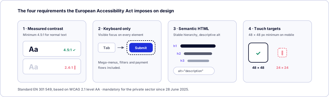
In practice, this comes down to four requirements that constrain design decisions:
- Measured contrast, not estimated. Minimum 4.5:1 for normal text and 3:1 for large text and essential interface elements. This is where fashion and law collide: dark modes with muted greys, text over photography and pastel corporate palettes frequently fail, and they have to be audited with tools, not by eye.
- Full keyboard operability. Every interactive element —mega-menus, filters, payment flows— must work with the tab key alone, with a visible, contrasting focus state.
- Semantic HTML and ARIA. Correct native tags, a stable heading hierarchy and descriptive alternative text on informative images, so screen readers can interpret the page.
- Adequate touch targets. Buttons and links with a minimum size of 48 × 48 pixels on mobile, which forces more generously spaced layouts.
The irony is worth pointing out: the regulation is pushing in the opposite direction to the year's aesthetic fashion. Glassmorphism, subtle gradients and low-contrast dark modes are exactly what generates the most compliance trouble. That's not an argument against using them, it's an argument for measuring them.
And there's a business fact usually left out of this conversation: more than fifteen per cent of the world's population lives with some form of disability. Treating accessibility purely as sanction risk is short-sighted; it's also a market share you're choosing to discard.
The patterns that repeat
1. Depth is back, and it comes with a bill
Glass, gradients, gloss and volume are back at Apple, Google and Xbox. The bill has three line items: contrast (text over translucent surfaces usually fails WCAG if nobody measures it, with the legal consequences of the previous section), performance (blur filters are expensive on modest phones) and scalability (a logo with reflections and shadows becomes a smudge at 16 pixels, as Spotify learned). Apple, with the best resources in the industry, had to add a transparency control six months later.
2. Motion is now part of the identity
YouTube, Tinder and BBH have formalised motion systems as brand deliverables, on the same level as the palette or the typeface. It makes sense: brands now live on screens, and without shared rules every team animates its own way. For a normal-sized project this translates into something very concrete and very cheap: define two or three durations, one easing curve and one entry direction, and use them across the whole site. And respect prefers-reduced-motion, always.
3. What had fragmented gets unified
YouTube stitching together Shorts, Music, TV, Premium and Kids. Coca-Cola unifying 200 markets. Xbox gathering up what had scattered under «Microsoft Gaming». Stripe tidying a site that had grown by accumulating patches. The underlying problem is the same: when a brand grows by accumulating products, the design fragments. The small-company version of this problem exists and is recognisable: a corporate site, a campaign landing page built by another agency, a shop running the theme's template and a newsletter in a different typeface.
4. You don't touch brand equity
This is the joint lesson of Spotify and Jaguar, and the success of Coca-Cola and Harley-Davidson. A brand's silhouette and colour are a transactional asset: users process them before reading anything. A redesign can modernise the treatment, the typeface, the motion and the entire system, but when it erases the recognisable codes, what the public perceives isn't novelty, it's an error.
Instagram illustrates it from the opposite direction: it changed the wordmark, which gets read, and left the icon, which gets recognised, alone. The mockery lasted a week, but nobody opened their phone and failed to find the app. That's the difference between a debatable redesign and one that breaks a reflex.
5. The custom typeface as an asset
YouTube Display with Sharp Type, Tinder's serif, Threads' custom letterforms, Söhne at Stripe, Robinhood Phonic, and Instagram's trio —Sans, Pen and Mono— covering interface text, handwriting and data. Typography is what differentiates a brand most when the logo is barely visible, and it's the first thing dropped when budgets tighten. You don't need to commission a bespoke family to use the idea: choosing a good variable typeface, serving it from your own domain and applying it with real hierarchy already puts a site ahead of most.
6. AI speeds up exploration, not judgement
Stripe generating twenty concepts where two used to fit, and still delaying a launch by a month over some animations. Airbnb producing 60% of its code with agents. Both things coexist: automation has lowered the cost of exploring and building, and precisely because of that the bar for average quality has risen and human judgement is what differentiates. When everyone can generate twenty options, the value lies in knowing which of the twenty works.
7. Content is written for machines too
Airbnb restructuring its listings so conversational agents understand them is the clearest signal of the year. Semantic structure, structured data and direct answers have stopped being a marginal optimisation: they're the condition for appearing in the answers people read without visiting any website. We expand on it in AI SEO.
What to take away if your company isn't Coca-Cola
None of these cases is replicable on a small company's budget, and it doesn't need to be. What is replicable is the reasoning:
- Redesign by symptom, not by calendar. Valid signals are that the site no longer represents what the company does, that conversion is dropping without explanation, that the CMS slows the team down, that the site doesn't meet accessibility requirements, or that performance has fallen behind. «Trends have changed» is not a signal.
- First check whether you comply with the European Accessibility Act. If you sell online, handle bookings or provide financial services, this is no longer optional and it's a better reason to redesign than any trend.
- Before touching the design, inventory your URLs. A 301 redirect map and a Core Web Vitals comparison before and after is what separates a redesign from a traffic collapse. We expand on it in our technical SEO guide and our practical Core Web Vitals guide.
- Measure contrast before falling in love with the effect. If Apple had to back down on Liquid Glass, the frosted glass in your hero needs checking too.
- Don't touch your brand's silhouette or colour without a strong reason. Modernise everything else.
- Write down your motion rules even if there are only three. Two durations and one curve, applied consistently, are worth more than twelve different animations done by eye.
- A system, not a template. Colours, typefaces, spacing and components defined in one place, so the next campaign landing page doesn't start from zero again.
- If you can, ship in parts. Publishing one section first, comparing metrics and continuing is slower on paper and much faster when something goes wrong.
And one consideration running through all of the above: if these cases teach anything, it's that the website is no longer the centre of the brand system, just one more surface. It gets designed alongside the app, the social profile, the newsletter and the Google listing, not before them.
How we work on this at yuGraphik
When we take on a redesign, the visual part is the last thing we touch. First comes an inventory of content and URLs, a review of which pages bring traffic and conversions, and a measurement of the current site's performance and accessibility. That material is what decides what gets kept and what gets rebuilt, and it avoids the most common outcome: a new site that's prettier than the old one and gets half the visits.
From there we produce a system —typefaces, scale, colour, components— before a mockup, because that's what lets a site stay coherent two years later, when a section nobody planned for has to be added. Contrast and keyboard navigation get checked during design, not in a later audit, because fixing them at the end always costs more. And we measure Core Web Vitals again after publishing, with the same criteria as before, so we can say whether the redesign improved anything or just moved it around.
Conclusion
2026 has been a year of big redesigns, and the coincidence isn't accidental: the flat design cycle that started at the beginning of the last decade is closing. Depth and gloss are back, motion is being formalised as part of identity, and brand systems are being rebuilt to work across dozens of surfaces at once. Underneath, two less visible forces push just as hard: automation, which has made producing cheaper and standing out more expensive, and European accessibility regulation, which has turned aesthetic decisions into technical obligations.
But the most useful cases for everyone else aren't the flashiest. They're Stripe delaying a launch by a month over some animations, Apple correcting Liquid Glass with a control rather than defending it, Netflix testing for a year before generalising a change, Spotify retracing its steps within a week, and Instagram absorbing a week of mockery without ever putting at risk the one thing users recognise at a glance. All five say the same thing from different angles: a redesign doesn't end when it ships, and the only way to know whether it works is to measure it.
Frequently asked questions
Which big companies redesigned their website in 2026?
The most significant cases up to August 2026 are Stripe's homepage redesign, its first in six years, led by Katie Dill and developed over more than a year; Airbnb's restructuring from an accommodation search engine into a services and experiences platform; and Netflix's web interface refresh, in testing since June. Alongside those, several brands changed their digital identity: YouTube (20 January), Xbox (23 April), Google Workspace (18 May), Apple with its Liquid Glass corrections (8 June), Tinder (17 July), Coca-Cola (20 July) and Instagram (13 August).
Why did depth and gloss come back to design in 2026?
Because screens and devices changed. Gradients, reflections and depth help separate interface layers on televisions, cars, glasses and phones with ever-better displays, something flat design handled poorly. On top of that, after a decade of flat, minimal logos almost every brand looked alike: volume is also a way to win back differentiation. Apple pushed the direction with Liquid Glass, and Google, Xbox and others followed.
What happened to the Spotify logo in 2026?
On 14 May 2026 Spotify replaced the flat green circle in its icon with a mirrored green disco ball, which kept the three sound waves knocked out in black, to mark its twentieth anniversary. The rejection was immediate and massive on social media, with users believing the app was broken or that they had installed malware. Spotify confirmed within days that it was returning to the original icon with a resigned message: «we know glitter isn't for everyone». The change had always been planned as temporary, but the reaction accelerated its removal. The lesson is about legibility at small sizes: in an app icon, silhouette and colour are worth more than ornamental detail.
What changed in the Instagram logo in 2026?
On 13 August 2026 Instagram unveiled a new wordmark, the first change to its logo in ten years. The full script it had used since 2016 is gone, replaced by a hybrid: lowercase print letterforms, more compact and heavier, with the script strokes kept only on the «s», the «r» and the «g». The app icon, the gradient square, is untouched. The wordmark comes with a refreshed brand system built on three typefaces —an updated Instagram Sans, the handwriting face Instagram Pen and the monospace Instagram Mono—, a lighter application of the gradient and new motion and interface rules. Adam Mosseri announced it on Instagram and Threads, and the rollout is gradual through 2026. The reaction was mocking: because of the closed shape of the «r», many people read «Instagzam».
Is web accessibility mandatory for companies in Europe?
Yes, since 28 June 2025. The European Accessibility Act (Directive EU 2019/882) obliges the private sector to guarantee the accessibility of its digital products and services, and each member state has transposed it into national law: in Spain it is Law 11/2023. It directly affects e-commerce, banking, insurance, travel, telecoms and digital platforms. The technical reference standard is EN 301 549, based on WCAG 2.1 level AA. Penalties follow each country's own regime; in Spain fines range from 301 to 1,000,000 euros depending on severity, plus the potential loss of access to public subsidies.
Is glassmorphism a good idea for an ordinary company website?
In moderation. Frosted glass works well on specific elements (a navigation bar, a featured card) and over controlled backgrounds. It becomes a problem when applied to body text: contrast drops, legibility suffers, and blur filters carry a rendering cost on modest phones. Apple itself had to add a transparency control in 2026 to fix exactly that. If you use it, measure contrast against WCAG and check performance before publishing.
How often should a company redesign its website?
There's no magic number, but a sensible cycle is three or four years for a serious visual overhaul, with continuous adjustments in between. The signal to redesign isn't the age of the site but concrete symptoms: the site no longer represents what the company does, conversion drops without explanation, the CMS slows the team down, the site doesn't meet accessibility requirements, or performance has fallen behind. Redesigning just because trends moved tends to be expensive and short-lived.
Can a redesign cost me rankings on Google?
It can, and it's the most common and most avoidable risk. Redesigns lose traffic when URLs change without 301 redirects, when content that was ranking gets cut, when structured data is lost, or when the new version is slower than the old one. With a URL inventory, a redirect map and a Core Web Vitals comparison before and after, a redesign doesn't have to cost visibility. After launch, two to four weeks of instability is normal while crawlers re-evaluate the new structure.
What is a motion identity and why are big brands adopting it?
It's the part of a brand system that defines how elements move: which easing curve, how long transitions last, how a logo enters and exits. Until recently it was improvised project by project. Big brands are formalising it because their identity now lives mostly on screens (app, web, television, console, video ads) and without shared rules every team animated its own way. YouTube was the clearest case of 2026: it built its first motion system from scratch.
Do you need a custom typeface to have a strong identity?
No, but it explains why the big players commission one. A bespoke typeface differentiates without relying on the logo, avoids licensing fees tied to traffic volume, and fits the languages and sizes the brand actually needs. In 2026 it's close to standard at the top of the financial sector, with cases like Söhne at Stripe, Wise Sans, Klarna Title or Robinhood Phonic. For a smaller company, the sensible equivalent is choosing a quality variable font, serving it from your own domain and applying it with real hierarchy, which is where the difference actually shows.
Is AI useful for redesigning a website?
It's useful for exploring, not for deciding. The best-documented case of 2026 is Stripe: the team used generative AI to produce twenty concepts in the time it used to take to make two, but kept strict human curation at every stage, because generated output carries detail and lighting defects the team calls «slop». They even delayed a launch by a month over some animations, to make sure the transitions were intentional. The takeaway is useful: AI speeds up ideation, human judgement defines the result.